This blog post assumes some familiarity with Playdate (a handheld game console with a cool crank control scheme), Playdate SDK and the Lua programming language.
During the development of my forthcoming Playdate game Ball und Panzer Golf (tentative title), I wanted to be able to draw to the debug layer from anywhere in my code. The SDK allows you to draw to the debug layer only from the drawDebug function.
After filing a feature request I thought about it some more and came up with a workaround:
1. (on initialisation) create a full screen opaque image
local gfx <const> = playdate.graphics
local disp <const> = playdate.display

overlay = gfx.image.new(disp.getWidth(), disp.getHeight(), gfx.kColorBlack)
2. (anywhere in your code) draw into that using pushContext (or lockFocus)
gfx.pushContext(overlay)
    gfx.setColor(gfx.kColorWhite)
    gfx.setLineWidth(2)
    gfx.drawCircleAtPoint(x,y,r) -- draw some debug stuff into our overlay image
gfx.popContext()
3. (in debugDraw function) draw the single image of our collected debug drawing
function playdate.debugDraw()
    overlay:draw(0,0) -- draw our overlay image containing all debug draws
    overlay:clear(gfx.kColorBlack) -- blank overlay ready for the next update
end
This means I can draw debug info about a thing from the same code and logic responsible for that thing. For me, with this game, that makes a lot of sense.

Abusing the system
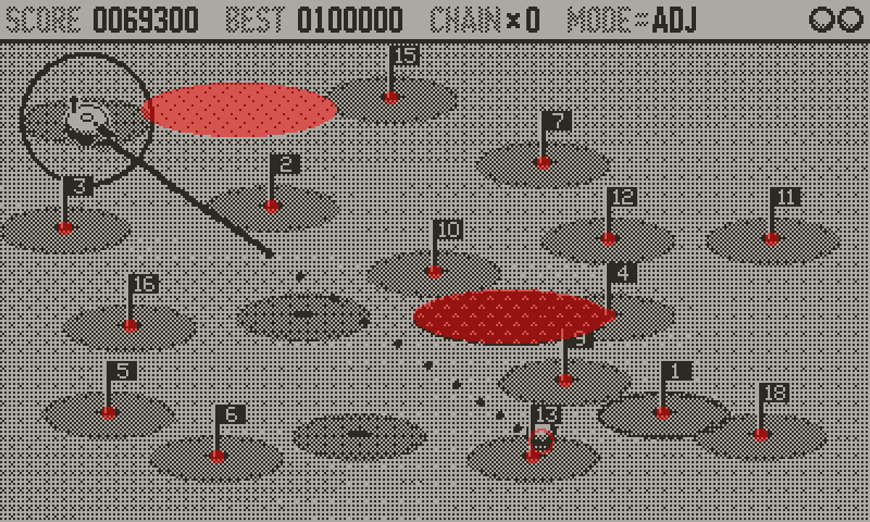
After debugging the positions of everything during my collision logic, it occurred to me that I could abuse this system to give the game a colour overlay.
I do this by using the debug draw in the opposite way to how it’s supposed to be used. Instead of drawing just the debug information, I set the hole screen to draw in colour and then—in the same way as above—at various points in my code I punch out areas of the screen I do not want drawn in colour.
I’m not quite drawing everything twice, as the areas that are punched out are simple shapes approximating the elements in my game. Plus, this is made easier for me because everything in the game is already being drawn only with filled shapes.
One interesting thing about this technique is that changing the contrast (dither pattern opacity) of the golf greens only when running in “colour mode” on the Simulator made things look better. That’s to say that adding colour also adds an extra complexity with regards to contrast. I think that’s the only change to the graphics I’ve done so far but there is opportunity for more.
When I sent a build out to testers I put a cryptic note in the changelog “added: chartreuse tinted glasses mode” but only one tester figured out what it was referring to. I had asked ChatGPT to suggest a colour that sounds like a shade of red, but is actually a shade of green: it suggested chartreuse (and so I use the “proper” chartreuse hex colour for the base colour of my green layer).
Multi-colour?
This approach could be taken further if the Playdate SDK allowed multiple colours to be used for debug drawing, keep an eye on this feature request.
Physical overlays
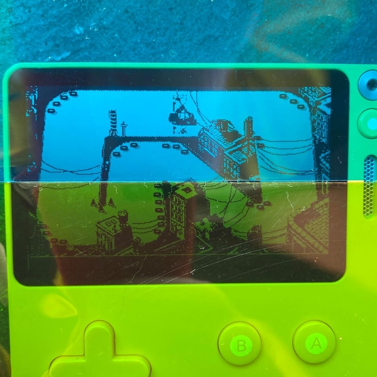
Back in October 2021 I bought transparency film in a range of colours to make a physical screen overlay, inspired by early arcade games like Space Invaders and the Vectrex gaming system, which worked but is obviously more hassle as the transparency picks up lint and gets dirty really quickly. This split of blue/green was for sky/grass in a 3D golf game.

Originally published: 2023-07-09
--
Fuel my writing habit with a ko.fi donation!
--
Comments: @gingerbeardman