I’m relaunching my “bubble era” T-shirt store on @teespring with international shipping in time for Christmas! teespring.com/stores/gingerbeardman
Retro games, computers, scooters and other cool logos on your favourite colour T-shirts!
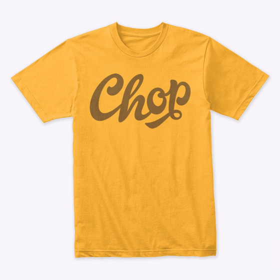
These T-shirts have been a side-project of mine for many years—I redraw old logos as vector art, just for kicks! The oldest designs—CHOP and SPRINT—date back over 15 years to the time when I realised how easy it was to get T-shirts printed
Every so often I pick a design out of my folder of ideas and draw it up as vectors. I find the process of redrawing shapes with “good paths” quite relaxing and therapeutic, kind of like an open-ended puzzle game. (glyphsapp.com/learn/drawing-…)
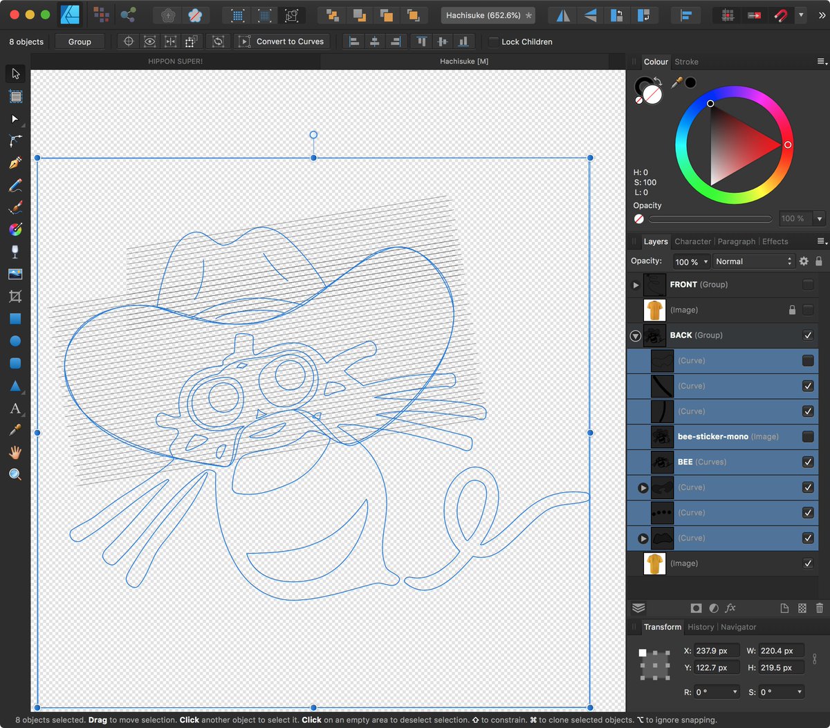
Hachisuke (ハチ助 in Japan; Hu-bee in USA) was the mascot of HUDSON SOFT. Apparently a mixture of bee and mouse or cat! Sometimes referred to as “a fanciful depiction of a bee”. After seeing this vintage T-shirt I set about redrawing it using old photo ref
The main outlines of Hachisuke were easy enough to draw, but the halftone dots on the hat took some thinking. Eventually I achieved the effect using a series of dotted lines. And I found a bug in @affinitybyserif Designer whilst doing it! (teespring.com/stores/gingerb…)
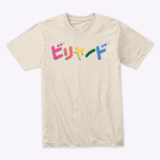
One of my other favourite logos is for an old game called BILLIARDS which features a balloon style typeface. At this time magazine layout and graphic design was likely to have been done using phototypesetting rather than using computer. (teespring.com/stores/gingerb…)
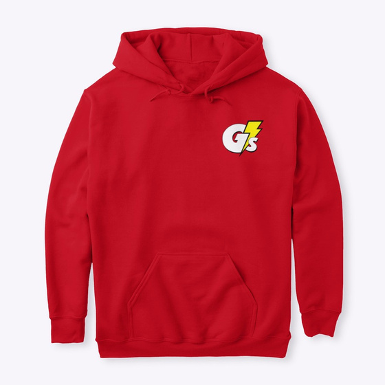
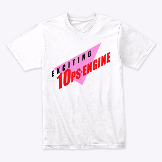
DENGEKI G’s ENGINE magazine evolved from covering just the PC-Engine and games by NEC, to a broader range of games. The G in the title refers to Gals and Games which means there is often a broad range of content in the magazine, if you get what I mean. 🍑 (teespring.com/stores/gingerb…)
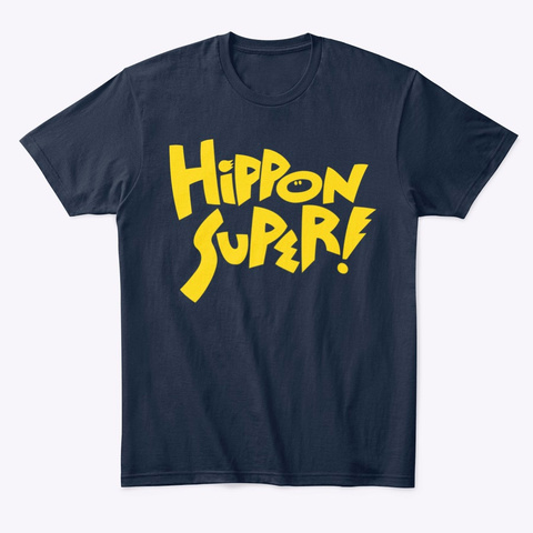
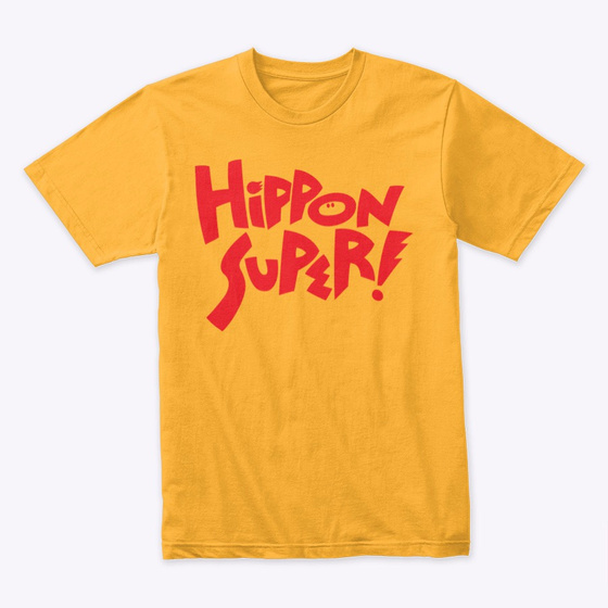
HIPPON SUPER! magazine was known for having a different tone than its main competitors, such as (Weekly) Famitsu and GAMEST. It had a whole bunch of logos over its lifetime, but I think the first one is by far the best. (teespring.com/stores/gingerb…)
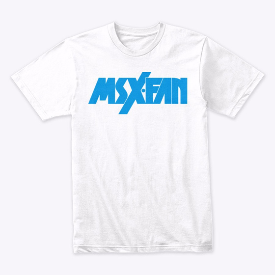
As much as I enjoy figuring out the best paths to represent a shape that was probably originally drawn/cut by hand, I’m happy to take some short cuts at times. Here on MSX・FAN I use two rectangles to cut into neighbouring shapes when I should have just used thick strokes
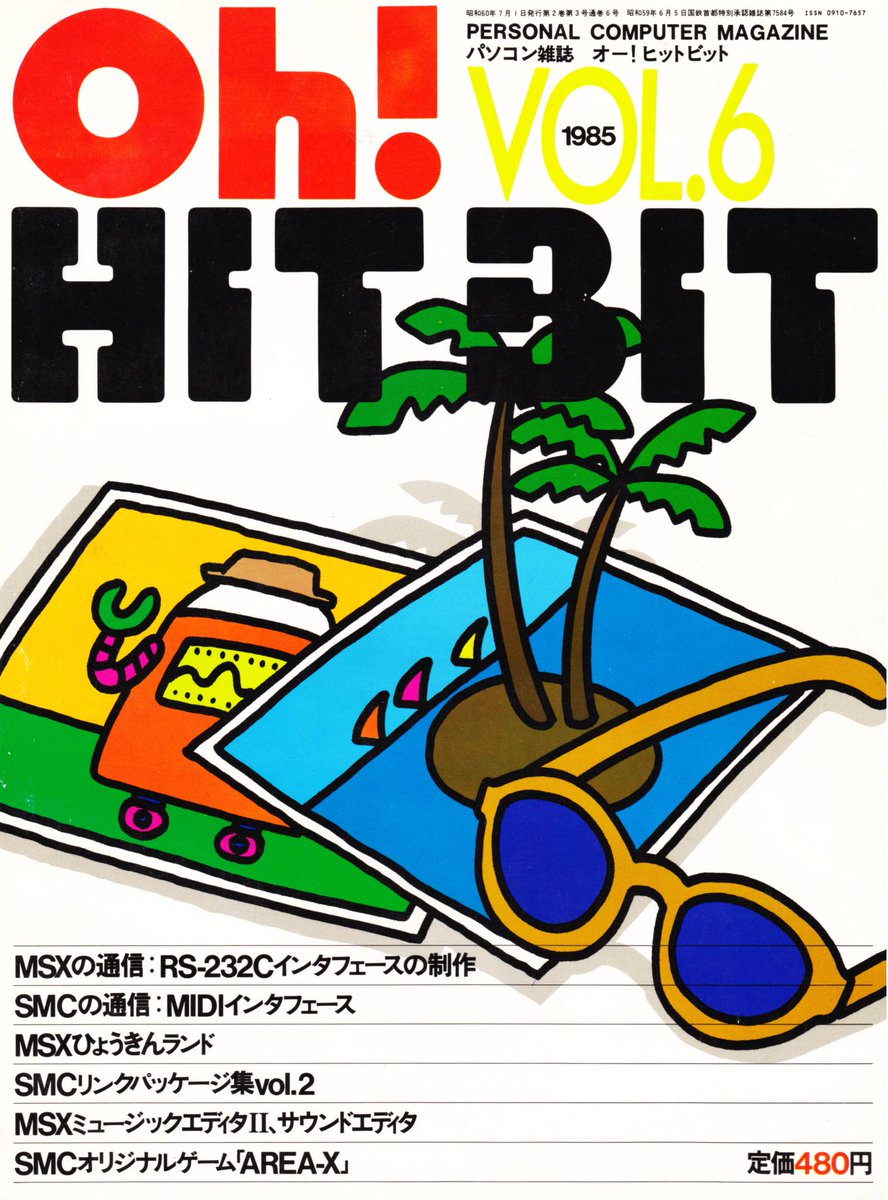
The “Oh!” series of home cpmouter magazines are some of my favourites, and each of them (there are dozens!) had wonderful logos. I redrew a handful of them in black and white so they work on dark or light coloured T-shirts. (teespring.com/stores/gingerb…)
Oh! MZ is probably my favourite of the bunch, featuring amazing cover art including Syd Mead’s Blade Runner concept art for no reason other than it looked cool.
The Sharp MZ-series of computers couldn’t do bitmap graphics so everything had to be done using the character set, which lead to this genius set of Hanafuda cards:
Oh! HIT BIT is a magazine specific to Sony’s line of MSX computers and was a real joy to redraw as it’s geometric nature allowed me to use a grid! I LOVE GRIDS. (teespring.com/stores/gingerb…)
Speaking of grids, there’s a cool app for macOS called KARO GRAPH which is a “graph paper” vector drawing tool with always-on grid and snapping to encourage structured drawing. I really dig it; you might too: (apps.apple.com/gb/app/karo-gr…)
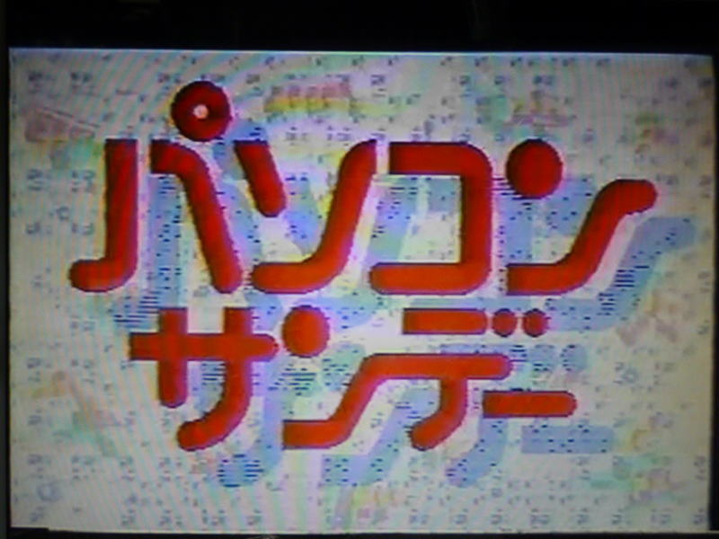
This next logo, for PASOCON SUNDAY, was spotted in a YouTube video of an old PC-focussed TV show. After spotting it there I managed to find higher resolution versions of it in Japanese magazines from the same era: (youtu.be/Bwpsbg6j0DI?t=…)
I should mention the custom type old Japanese video game magazines used to headline articles about various games. SO COOL. (teespring.com/stores/gingerb…)
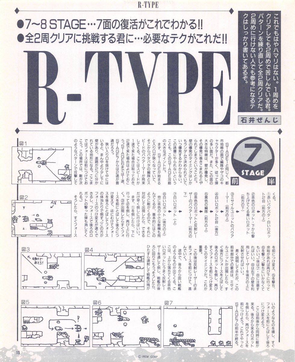
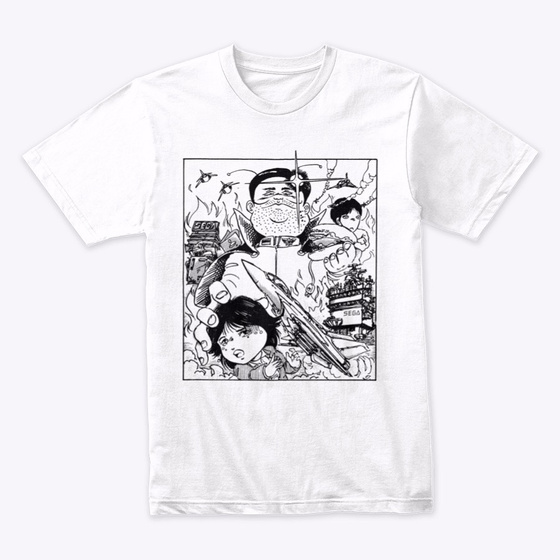
Articles often contained custom illustrations. I chose to take them out of their original context and surroundings and place them as large as possible on the front of a T-shirt. (teespring.com/stores/gingerb…)
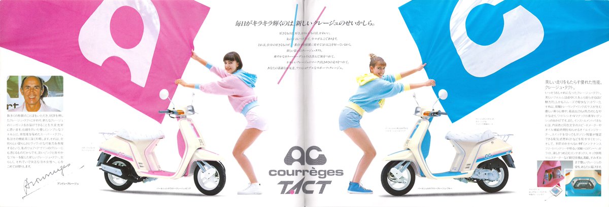
Another love of mine are “bubble era” Japanese vehicles, from crazy vans with skylite roofs to cute scooters. All of which seem to have the coolest names. (teespring.com/stores/gingerb…)
If you’re into those check out my collection of old Honda scooter brochures: (flickr.com/photos/emsef/s…)
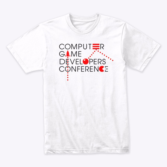
Moving from Japan to USA @scottekim has kindly given me permission to reproduce some T-shirts he designed in the 80s for CGDC (Computer Games Developer Conference, which became GDC after they realised games are also on consoles) and HACKERS’ CONFERENCE (as worn by @AndyHertzfeld)
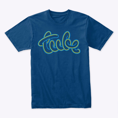
Back in the UK 80s music TV series “The Tube” had a logo that was actually a neon tube light. Drawing this was similar to the previous BILLIARDS logo, but its more freeform nature actually made it more difficult! (teespring.com/stores/gingerb…)
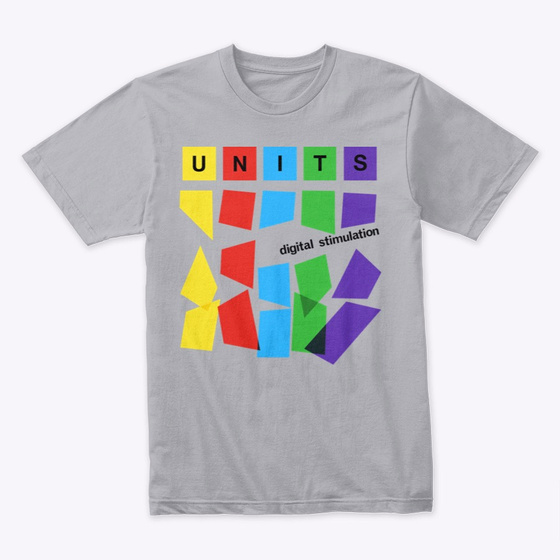
UNITS “digital stimulation” is the album cover for the 1980 release but I added to the bottom of the design to make it look better on a T-shirt. The original artwork was created with strips of translucent plastic and the print on the T has the same effect! (discogs.com/Units-Digital-…)
Help keep this blog running with a coffee donation!
--
Comments: @gingerbeardman