I’ve previously written about the Playdate game Sparrow Solitaire, when we released the Early Access version of the game. That was almost 9 months ago and a lot has changed!
This week the hugely expanded full version of the game released on itch.io, where it’s been for sale for a while, and on Playdate Catalog the new on-device store. It even got its own website!
This post is a continuation of the history of the development of the game, going into the conceptual decisions and visual inspiration.
Mahjong or not Mahjong, that is the question?
This type of game is commonly called Mahjong Solitaire, because it uses mahjong tiles to form the layouts and it’s usually a single-player game. But the traditional tiles are somewhat inscrutable to newcomers. They are from a totally different game that goes by the name of Mahjong, which further confuses the situation. For this reason most Mahjong Solitaire games use alternative, more recognisable and approachable tile patterns.
Whilst reading about the history of mahjong, I discovered that in Chinese the game was originally called 麻雀 (pinyin: máquè)—meaning sparrow. This seemed like a nice alternative name for the game, allowing me to use alliteration, and avoiding the complexity that comes with the traditional mahjong tiles, and of course having cultural sensitivity top of mind.
A brief history of Mahjong Solitaire
Mahjong Solitaire is widely considered a Western invention in much the same way as French-suited playing cards and their related Patience/Solitaire games, but both have their origins in China.
Computer game Mahjong Solitaire was originally created by Brodie Lockard in 1981 on the PLATO system and named Mah-Jongg after the game that uses the same tiles for play. Lockard claimed that it was based on a centuries-old Chinese game called “the Turtle” that he had been shown whilst in hospital after a serious accident that left him paralysed from the neck down.
Not only did Brodie create the PLATO version in 1981 using only his mouth to type the code and draw the graphics, but he went on to make the Apple Macintosh version which was published in 1986 by Activision, as Shanghai, which sold millions of copies. Shanghai II came in 1989 and a whole new genre of games was born.
Wherefore art thou Macintosh?
An interesting point about the first two versions of the computer game: they both had monochrome displays (also referred to as 1-bit). PLATO was orange on black, and Macintosh was black on white. Funnily enough Playdate is also monochrome: dark grey on pale grey. Upon seeing the Sharp Memory LCD display that is used in the Playdate I was instantly reminded of the original Apple Macintosh. I mean, I still use System 7 on an iPad Pro and have a 1991 Macintosh Classic at home so it did not take much to remind me, but it did.
My initial explorations around 1-bit graphics happened on Macintosh, long before I had ever held a Playdate in my hands. I explored fill patterns, dithering algorithms (eventually discovering and popularising a little known algorithm), old drawing software optimised for 1-bit graphics, and diving head first into old clip art collections. Sparrow Solitaire could be considered the culmination of all of this exploration and gathered knowledge presented in a single game.
Once I got hold of a Playdate (eternal thanks, Louie!) I started thinking about implementation details. Coding prototypes, figuring out sizes, textures, shadows, frame rate, tricks, optimisations, but with no particular game in mind. Just sailing free across a sea of ideas.
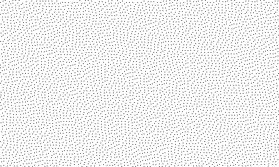
I struck upon a novel way to generate patterns of dots. Instead of using organised Beyer dither patterns, I used error diffusion dithering and fed it a solid colour. When a shade of grey is run through Burkes dithering algorithm it produces organic-looking patterns of dots that are ever so pleasing to the eye. Interestingly, other dithering algorithms don’t exhibit the same result. This image became a catalyst and the core of Sparrow Solitaire.

After this I drew the traditional Chinese mahjong tile set, and figured out a tile size that would allow the standard Mahjong Solitaire layouts to fit fully on screen. Unlike the PLATO and Macintosh games, which used border thickness to denote the height of a tile in the layout, I offset the tiles in a sort of isometric view and added a repeating shadow dither pattern. After this I drew regional variations for Japan, Europe and America. I drew tile sets inspired by the original late-90s Japanese Emoji set, others based on Egyptian and Toki Pona heiroglyphs, and an alphanumeric tile set I thought might be easiest for newcomers. I even recorded sounds of my own mahjong tiles.
Sunset
I found (and promptly forgot about until just now!) royalty free sound effects of sparrows, rain, button presses, confirmation tones. During all of this, amongst my normal music listening, I stumbled across a song that I thought sounded really great: it was the track “Starry Dish” by Yuyake Monster a Japanese music producer. The track is a sort of bouncy low-fi video-game hip-hop and piano thing. I wanted to hear more by this musician, so I clicked on their profile and listened to the next track. It was “Herbal Remedies” and I liked it even more! It featured plucked strings and a melodic bass line and… about half way through… bird song! And these tunes were already tagged as royalty free, so it was meant to be. When I reached out to Yuyake Monster they were super happy to have their music used in a game.
It was at this point that I released a prototype with graphics, sounds and animation of the layout dealing. I quickly realised that it would take a lot of time and effort to finish the game, so I made the difficult decision to abandon it. But work resumed later on with the help of Mac Vogelsang, as you can read about in my earlier blog post.
One vision
Mac had taken on the majority of the programming, slowly eroding what remained of my prototype code and refactoring things into a more solid foundation. I was concentrating on graphics and animation. We shared game design decisions. By this point we had both played a ton of mahjong solitaire games from the original Shanghai on Macintosh, through versions on almost every home console, handheld and home computer platform, to versions on the latest Nintendo consoles. We had a thorough understanding of things that worked well with a mouse, what did not work so well with a game controller, what worked best on screen and what limitations these old platforms imposed on the games.
Comparing Playdate to the best handhelds from the 90s it became obvious that we were working with a much more capable device, in terms of both CPU power and graphical fidelity. We could lean into the strengths of the device and provide a tailored experience that made use of the Playdate’s unique control mechanism - the crank - as well as its excellent sound and graphics hardware. I hope Mac will write more about getting the most out of the device, writing code that made the most of Playdate performance to do things that have never been done before in a mahjong solitaire game. Sparrow Solitaire has truly ground-breaking features some of which are only possible on Playdate.
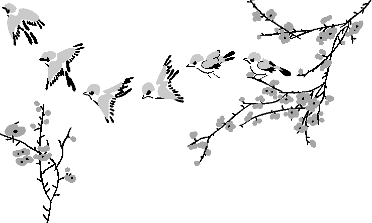
Meanwhile, with the prompting and encouragement of Mac, I researched classic Chinese and Japanese painting techniques and drew some Eurasian tree sparrows and cherry blossom in the classic ink and watercolour style.

These illustrations were used to create the game’s launch animation. I started to create the animation the traditional way, but quickly changed tact and created it programatically instead.

Content matters
For the full version of the game I created additional backgrounds, cursors, grids, animations, tools to aid development and more besides. I created several fonts, all carefully kerned and tweaked to look their best on the Playdate. I’d created a popular font in my teens and it was fun to get back to that. More backgrounds, more tile sets including my favourite “zen”. Even now, when I see this tile set in the game, I often shake my head in disbelief. How was I capable of drawing these symbols so well at such a small size? My Susan Kare moment, if you will. If ever there was a lesson that you should believe in your own abilities, this was it for me.

Hidden in plain sight
The influence of the Macintosh and the nostalgia in the final look and feel of the game is something I wear proudly. Sparrow Solitaire is the sum total of all my passions and interests, wrapped up in a neat little game that will provide hundreds of hours of fun and relaxation.
But what about if you look a little deeper? You will find brush/fill patterns from MacPaint, Atkinson dithering as first seen in ThunderScan, elements drawn in UltraPaint, pixels generated using DeBabelizer, and so much more. Heck, we even use Garamond as our brand typeface which is the same one Apple used in their classic Macintosh advertising, the most well known of which is the “Think different” campaign. Sparrow Solitaire is my love letter to the Macintosh, but runs on a device that fits in the palm of your hand.
One of my favourite “Easter Eggs” in Sparrow Solitaire is some clip art from the Scroll collections, published in 1986/87 by Japanese Macintosh specialists Enzan-Hoshigumi. Specifically I have used a border for the manual/credits overlay, and several sections of artwork for our patterned backgrounds. These sections of artwork were not bundled as brushes/fills, but are nevertheless easy to cut out and use as a repeating fill in an image editor. They are based on repeating elements that are much larger than the 16x16 pixel patterns of MacPaint, so they allow for patterns that are not as garish and easier on the eyes. Plus, I love the fact that in 2023 Enzan-Hoshigumi finally have their first video game credit, almost 40 years after working on their first video game.

The Great Wave of Mahjong
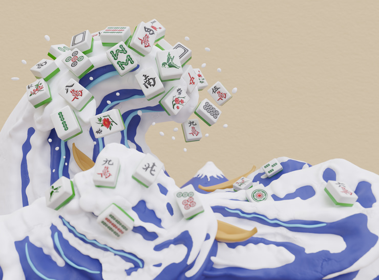
Finally, to come full circle back to the image seen in the trailer at the top of the page: “The Great Wave of Mahjong”. I came up with the concept for the image and commissioned the wonderful Vxcl to create it, leaving them free to interpret the brief. They pretty much nailed it first time, and there were only a handful of small notes from me - in the form of screen grabs with coloured highlighter markup - to tweak the alignment of details of a few elements. This is the second such render I’ve commissioned, a look inspired by 1980s Japanese PC/game mags.
You can download a high resolution version of this image at itch.io to use as PC/phone wallpaper.

Update!
Less than two weeks after version 1.0 we released an update to address a few small issues and add a bunch more content! It features dynamic weather effects, three new tile sets and more cool stuff. You can read about version 1.1 in this Twitter thread.
Fuel my writing habit with a ko.fi donation!
--
Comments: @gingerbeardman